Studio-wide & Project Tower Meetings
There is so much stuff to talk about in this final devblog! I'll kick off by saying that meetings haven't been much different this sprint. Same old, same old. I did arrange a small celebration for both projects for Sunday 12/12, though, which was a really nice way to congratulate everyone for making it through another semester.
Project Tower UI Overhaul
In response to some feedback that we received in a playtest with Jordan Ajlouni, I made very significant UI changes which had been sitting in the backlog for ages. I also began fixing a few minor things that I felt seriously took away from the professionalism of the game.
In the video above, we have an intermediary glimpse of some of the first changes I made:
- Previously, the tower range icon was just a default Unity circle that turned neon red and neon green, depending on whether or not you could place a tower there. It was pretty painful to see. I changed it to a softer grey circle, reminiscent of the tower range display from Bloons TD 6.
- The tower description text used to overflow all the time. Also a little painful, especially for first-time playtesters.
- There used to be a LOT of negative space in the Tower selection UI, which made it feel as though something were missing. I changed out the background sprite entirely (it used to be a black rectangle) and began experimenting with a more interesting shape/color. As you can see above, it's not exactly themed with the rest of the game at this point, so I do end up changing it further later.
- I removed dynamic spawning altogether from the tower actions screen. Given that each tower is guaranteed to have two upgrades, and each tower is guaranteed to have a sell button, it really makes no sense that these buttons are instantiated at runtime. The system itself is understandable, but for our purposes, it was a lot easier to make aesthetic changes after I made everything static.
But of course, the above wasn't it. Game UI is really tricky to get right, because the smallest things can make an otherwise excellent game look amateur-ish. This is - of course - subjective, but I felt that we could do even better. Thus, we step into discussion on "part 2" of the UI overhaul.
Disclaimer - I didn't touch the main menu at all (I only mention this as the video above briefly displays the main menu). I completely changed the visual theming of the UI, both in-game and in our narrative scenes. I moved in the direction of stone tablets, which I felt was appropriate with the Norse-inspired visual of our game (with rune stones and what-not). I also moved certain elements of the UI around, such as the pause and play buttons, in an attempt to make their placement more intuitive.
Additionally, I made a small change that updates tower portrait art with tower upgrade purchases (this way, we can see all of our artists' work)! I added tooltips to the tower purchase screen to make them a bit more readable. Finally, I enforced some consistency in our font choice. Whilst performing these UI changes, I also added small visual tweaks (such as a few new 2D lights) and integrated some final art assets into the game.
While the end product certainly isn't close to perfect, I do think the experience feels a bit more polished as a result of these changes. For reference, this is what the UI looked like before these changes:

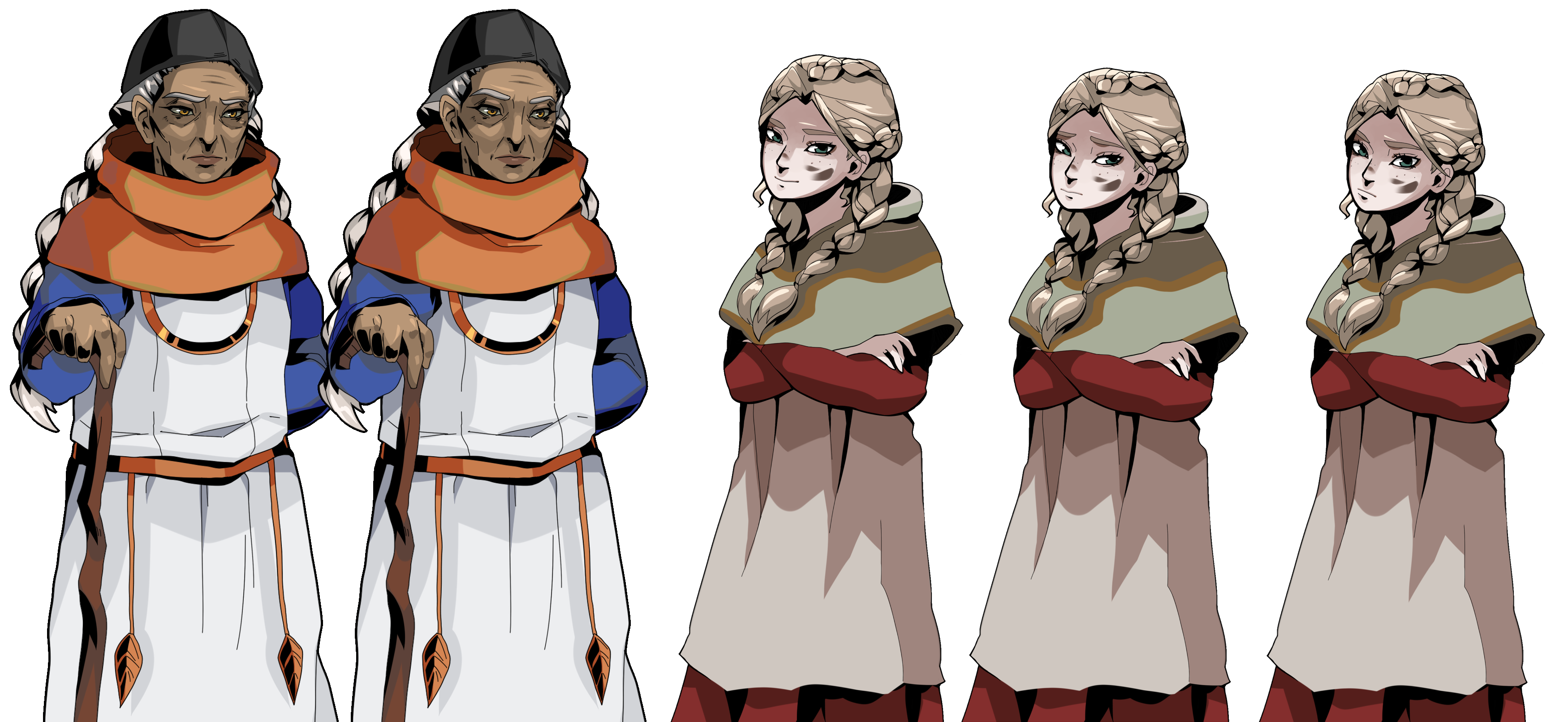
Final Narrative Art
There's not too much to say here, other than that I finalized the narrative portrait art for Revna and Yrsa! Revna looks very similar (but a lot less sketchy). I made some big changes to Yrsa, as I wasn't very proud of how her sketch came out. I gave both characters a couple different expressions.
Cover Art
And now to discuss the star of the show - the cover art(s)!
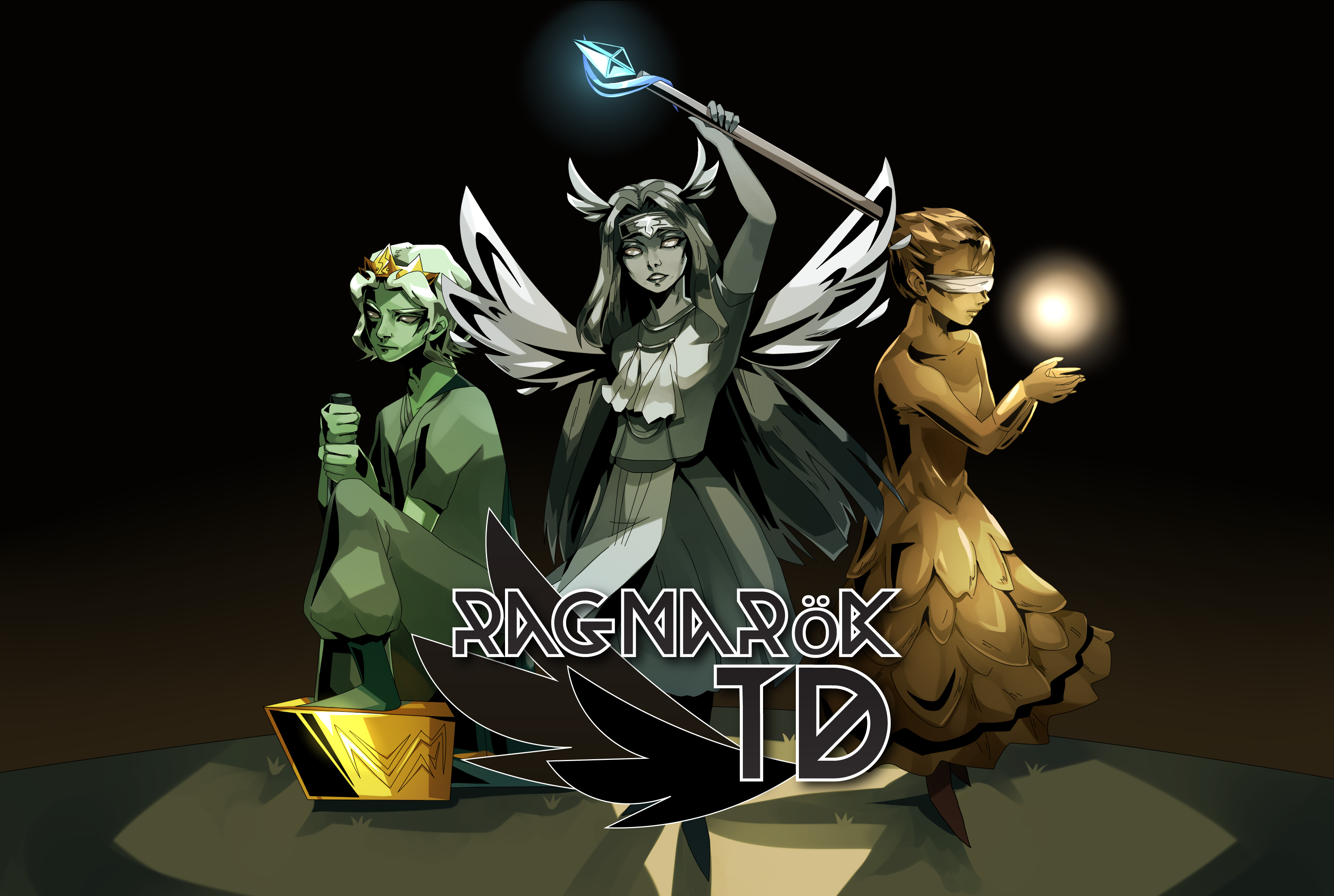
Ragnarok TD
As I had already blocked out two (messy) key art pieces for Project Bloom, I decided to first focus my attention on Project Tower. I didn't have much in mind other than that I wanted to focus on the three gods we managed to represent in the game: Thor, Freyja, and Sunna.
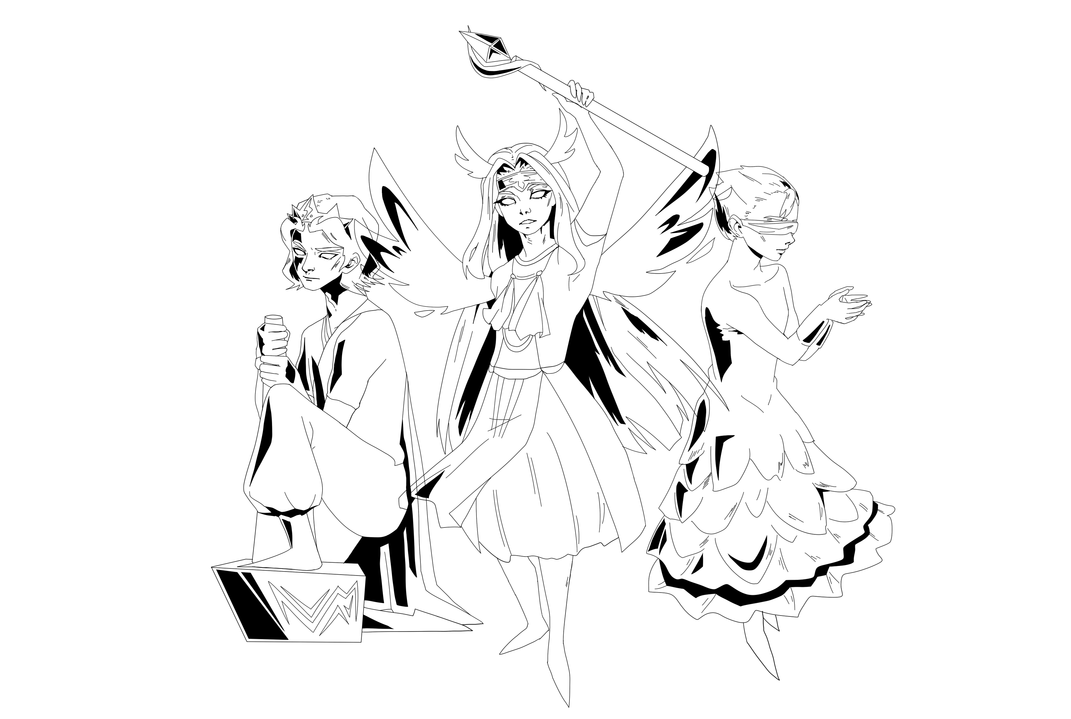
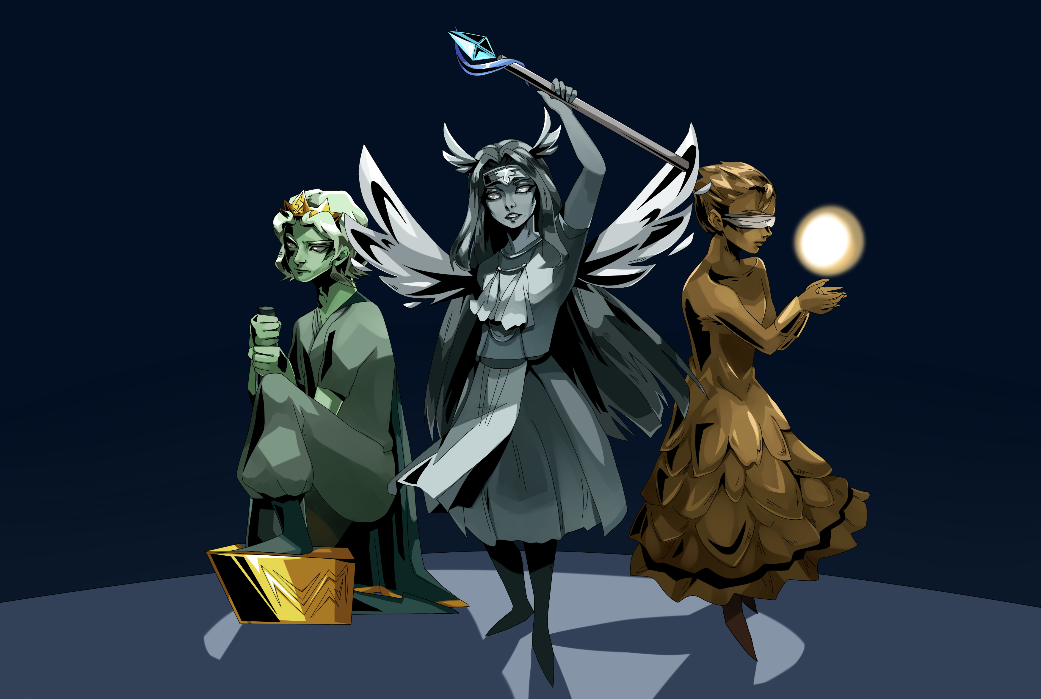
Typically, I create a detailed sketch before I move into cover art. This time, though, I was in a bit of a rush, and so I jumped straight into inked lines. It somewhat messed with the anatomy, but I think we can smoothly play it off as stylization! After lining the art, I colored it, and then made some color adjustments.
The title art (Ragnarok TD with the wings) was a little rushed on my end. I threw something together very quickly in Adobe Illustrator. I think it works, but it wasn't very well thought out. Also, as a fun aside, I ended up doing some quick animation of the cover art for the trailer using Adobe After Effects. Take a look below.
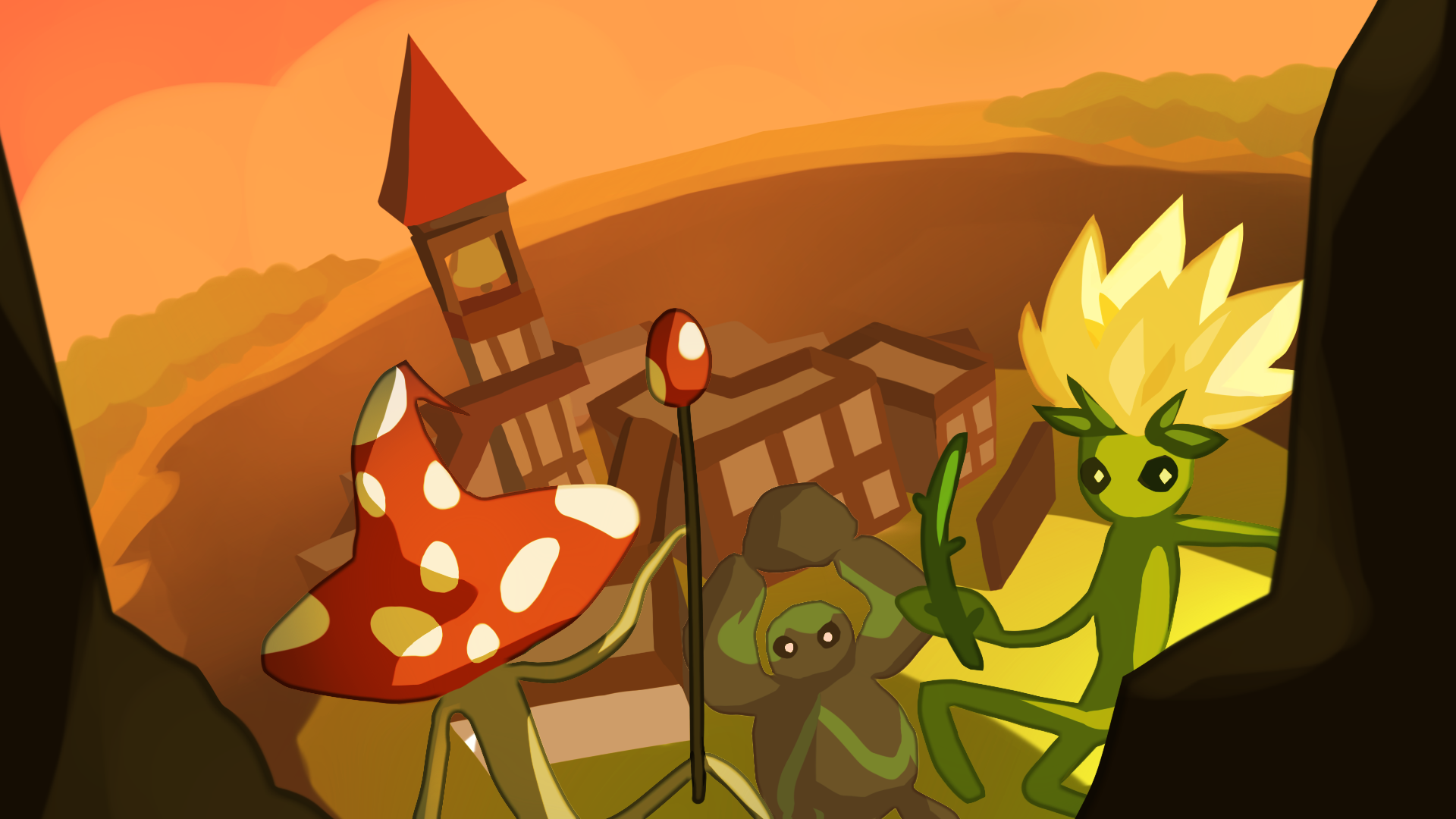
Bloom: Roots of Renewal
I wish I could have spent a bit more time on the cover art for Bloom. After I blocked out the first potential cover art concept, the team asked that I block out the second so that they could compare. Both drafts can be seen below (but only the red-orange one was created this sprint).
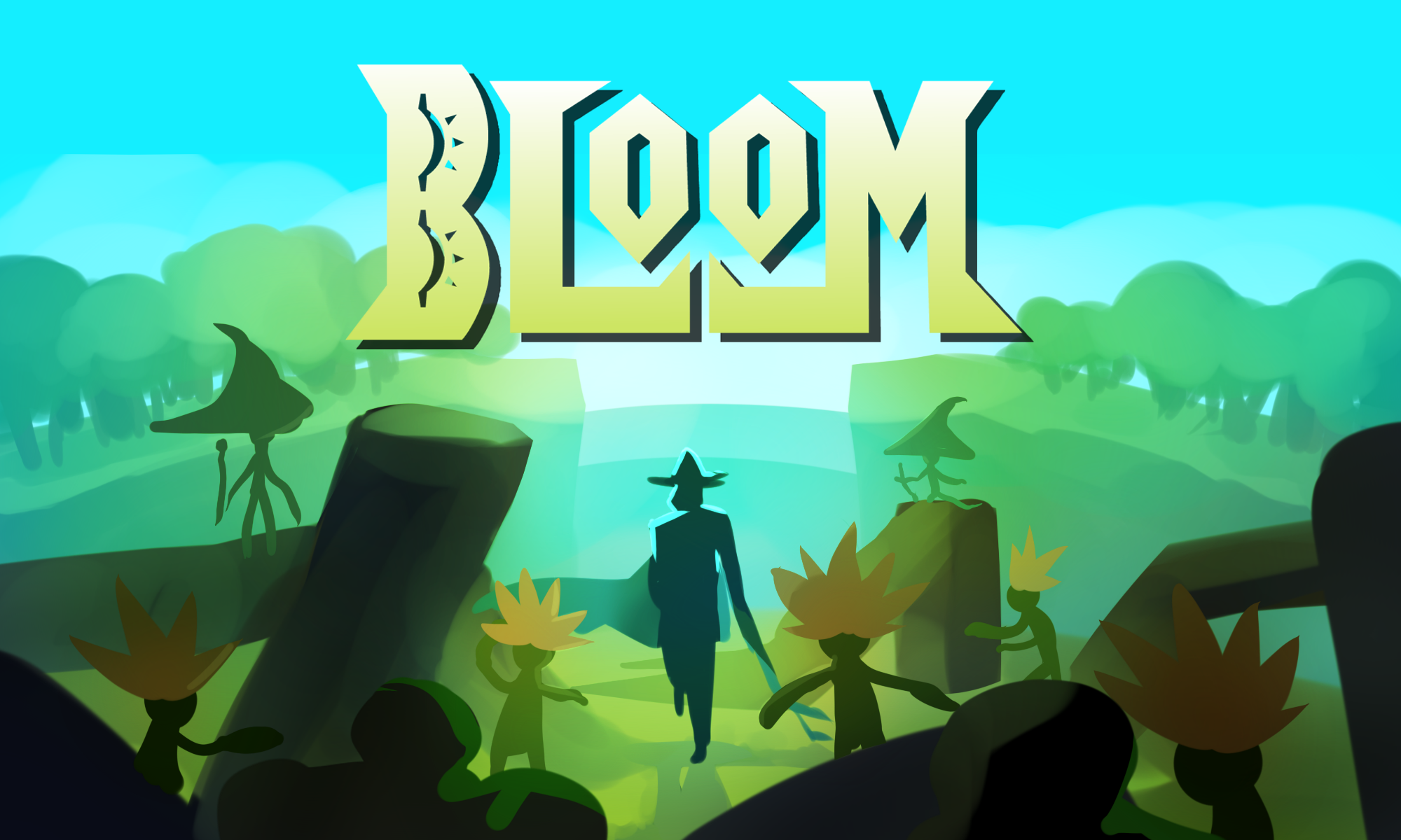
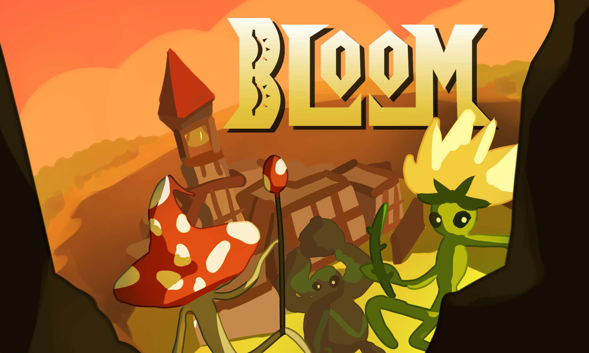
After comparing the two images, the Bloom team preferred the red-orange one (the one on the bottom). I definitely agree that it captures the overall vibe of the game a bit better (and the composition is more dynamic). After wrapping up the trailer and cover art for Ragnarok TD, I went back in and polished their preferred cover art. Unfortunately, I wasn't able to do this before the team registered for the showcase. The polished cover art can be seen below. I'm not the biggest fan of how it looks, but it did come out okay.
Ragnarok TD Trailer
Very kindly, Jackson volunteered to do the Bloom trailer, and so I was able to focus only on the Ragnarok TD trailer. This was a tremendous help.
I knew that I wanted to include elements of narrative in the trailer, and so I recreated a small part of the opening cutscene. I created two 2D art slides for this (credits to Zelin for the background of the first one).
I'm very much not a fan of how the second slide turned out, but given time constraints, I couldn't go back in to fix it up. I then put the trailer together using some of the beautiful backing tracks by our audio team, as well as a couple CC0 sound effects from freesound.org. The final trailer looks like this:
Itch Pages
Finally, I set up Ragnarok TDs itch page (and also made some small modifications to the Bloom itch page).
We're doing very well on itch.io right now, making it into the top 5 through top 20 of a few tags! It's always really exciting to share this kind of news with members. A huge thank you to Paul for helping me record a ton of GIFs of Project Tower.Conclusion
So, this is it! My final devblog in WolverineSoft Studio. It's been incredible to be a part of something so special for so long. The studio has grown so much since Dreamwillow, and so have I. No words can describe how it felt to step out of the BBB for the last time after a studio meeting! I'm so moved by the amazing people I've been able to work with and get to know over the past 3 years.
With George and I graduating, everyone who was a part of the studio's conception is gone. Goodbye to an era, and a huge welcome to this new chapter! I can't wait to see how the studio - and how game development at Michigan - will grow.
Thank you so much for everything that you do. It's meant so much to me. If I can ever give back to the community and to the people who have given me so much, know that I'll jump at the opportunity - always.